Huttons Rebranding a London retail chain
Huttons is a London-based retail chain covering a diverse product range from small gifts and women's clothes to high-end furniture. They required a complete rebrand including new design solutions for signage, point of sale, and marketing materials. They appointed graphic design agency Superfried for the project.
Previously their brand positioning had solely focused on a female demographic. Despite 80% of customers being women, research showed that this was changing, so it was important to devise a new brand strategy that would ensure their brand identity did not alienate potential male customers.
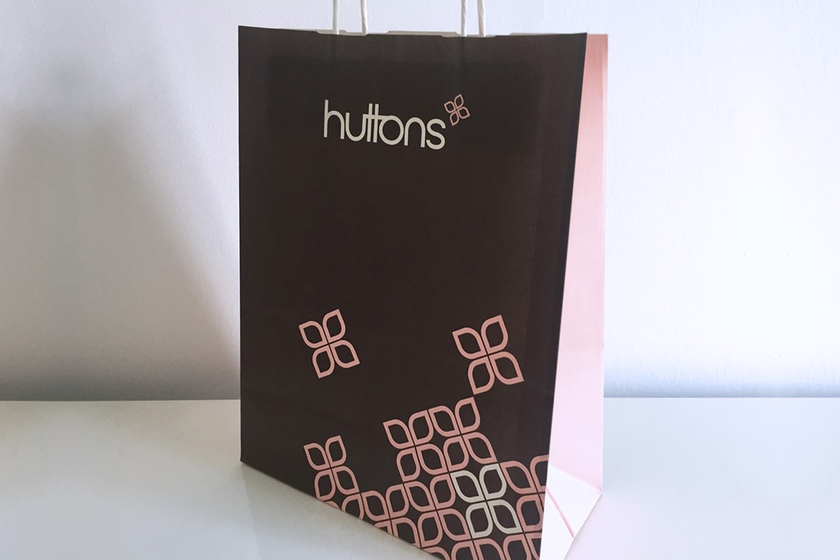
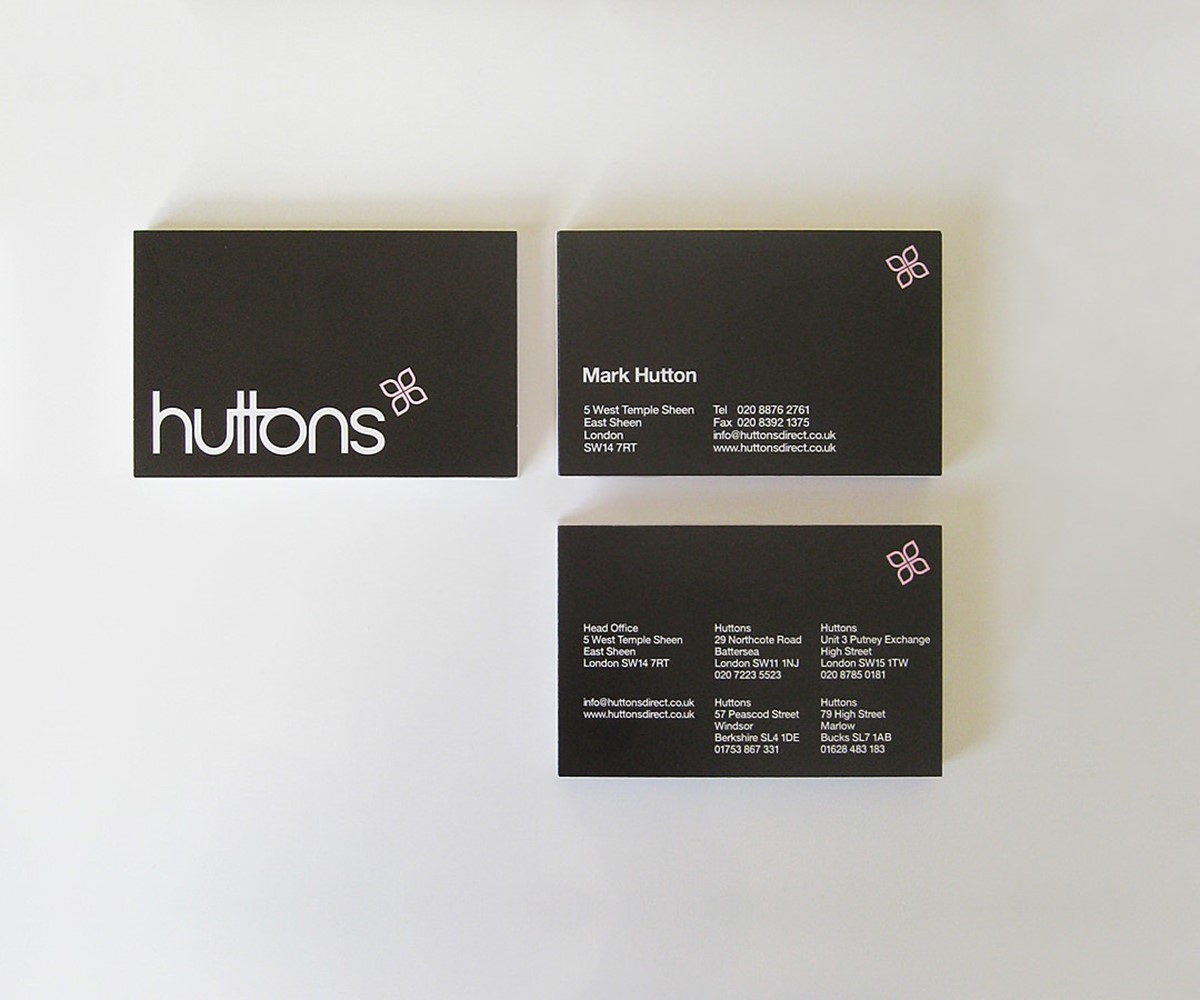
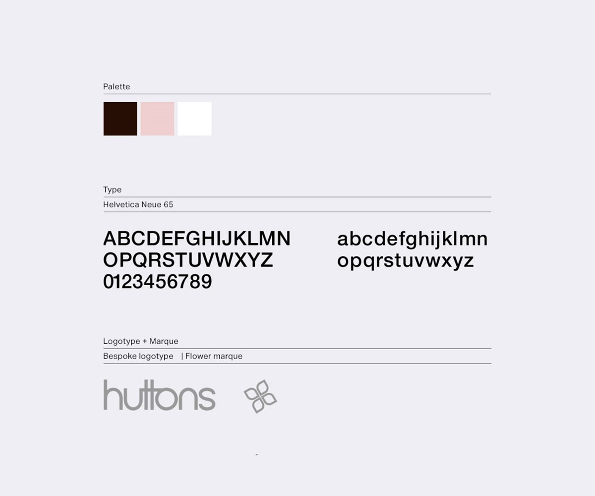
To meet this fine balance, an abstract marque was designed with sufficient ambiguity to potentially suggest the form of a flower or a star. For the logotype design, bespoke typography was developed to create distinction, whilst also ensuring a very gender-neutral appeal.
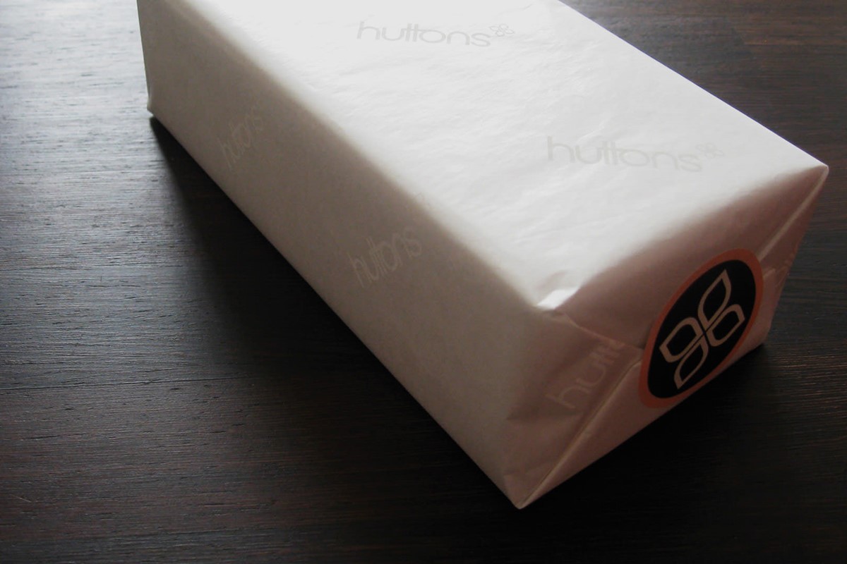
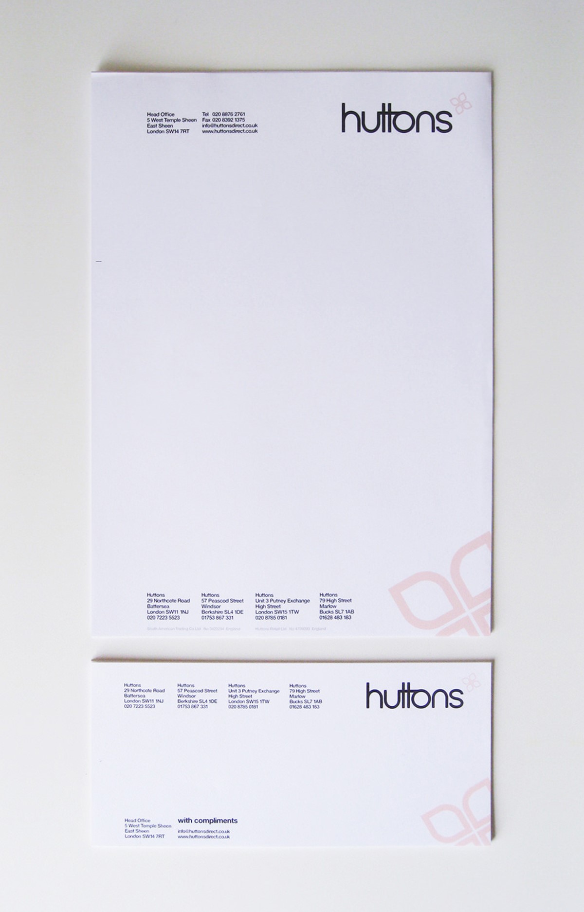
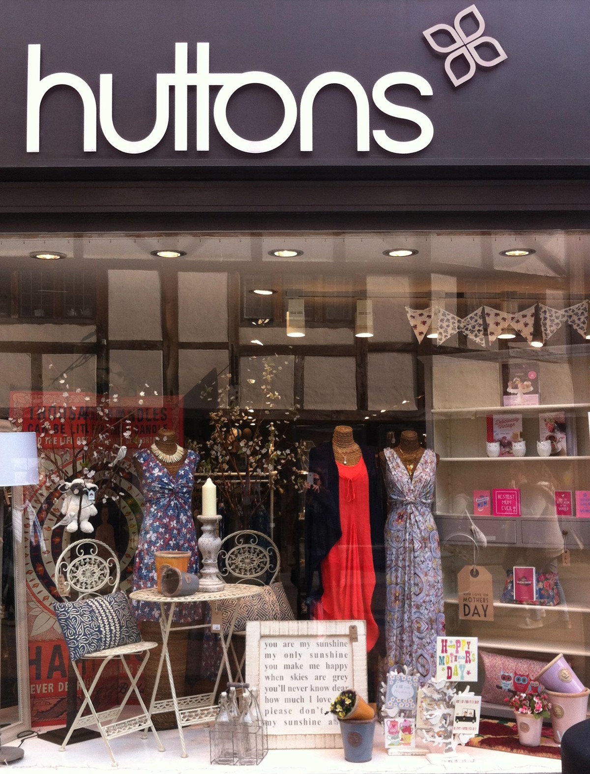
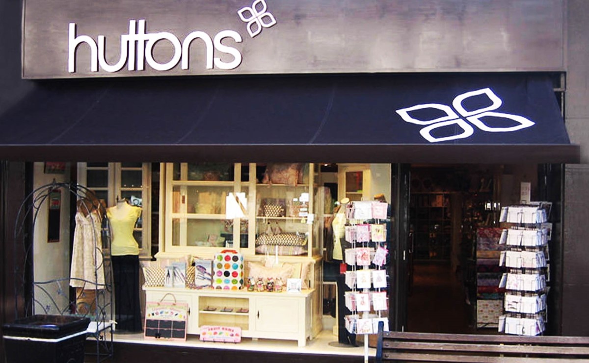
Careful consideration was taken when selecting the brand colours. For the marque, a very subtle pink was selected. In contrast, the primary brand colour was a much stronger, sophisticated dark chocolate brown. The new brand identity was rolled out across the retail chain with new design solutions for their stationery, signage, packaging, and point of sale.
The rebrand was an immediate hit with new and existing customers. Hutton's profile raised considerably leading to features in lifestyle publications and business growth through the development of an online retail presence.
Project services
- Art Direction
- Bespoke Typography
- Signage
- Packaging
- Strategy
- Branding
Testimonials . Press . Awards
"Superfried did a fantastic job developing the brand identity for Huttons. I would not hesitate to recommend them."
—
Mark Hutton . Director
Huttons . London
—
Since completion the project has been featured in six design publications including international best seller Los Logos 4.