


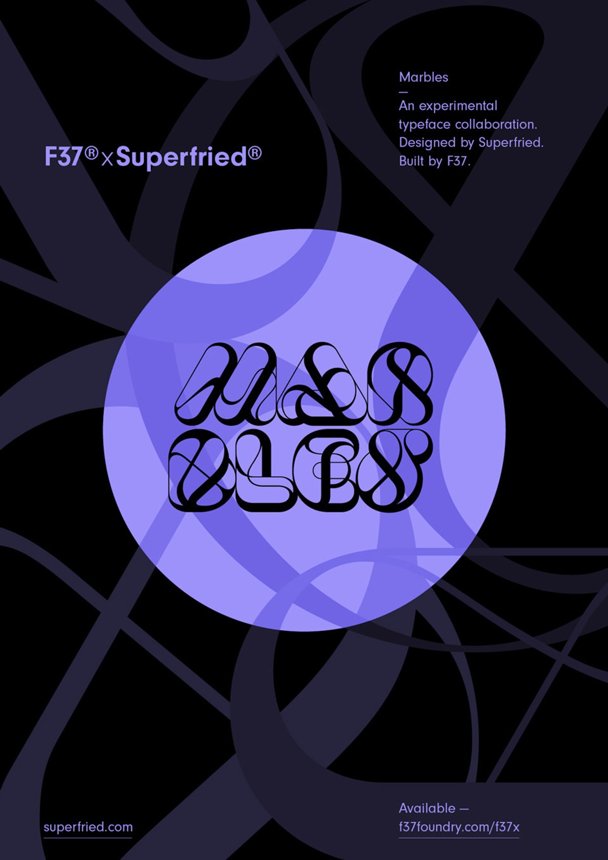
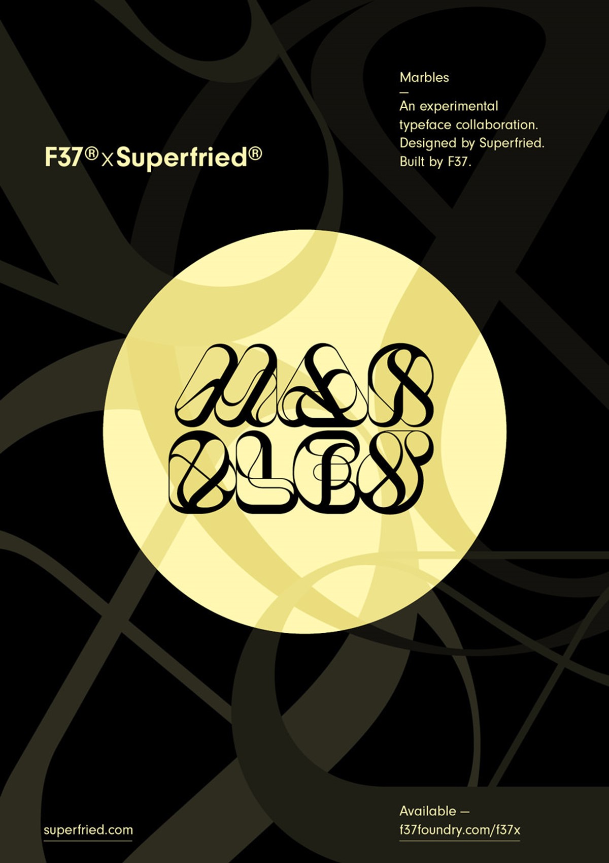
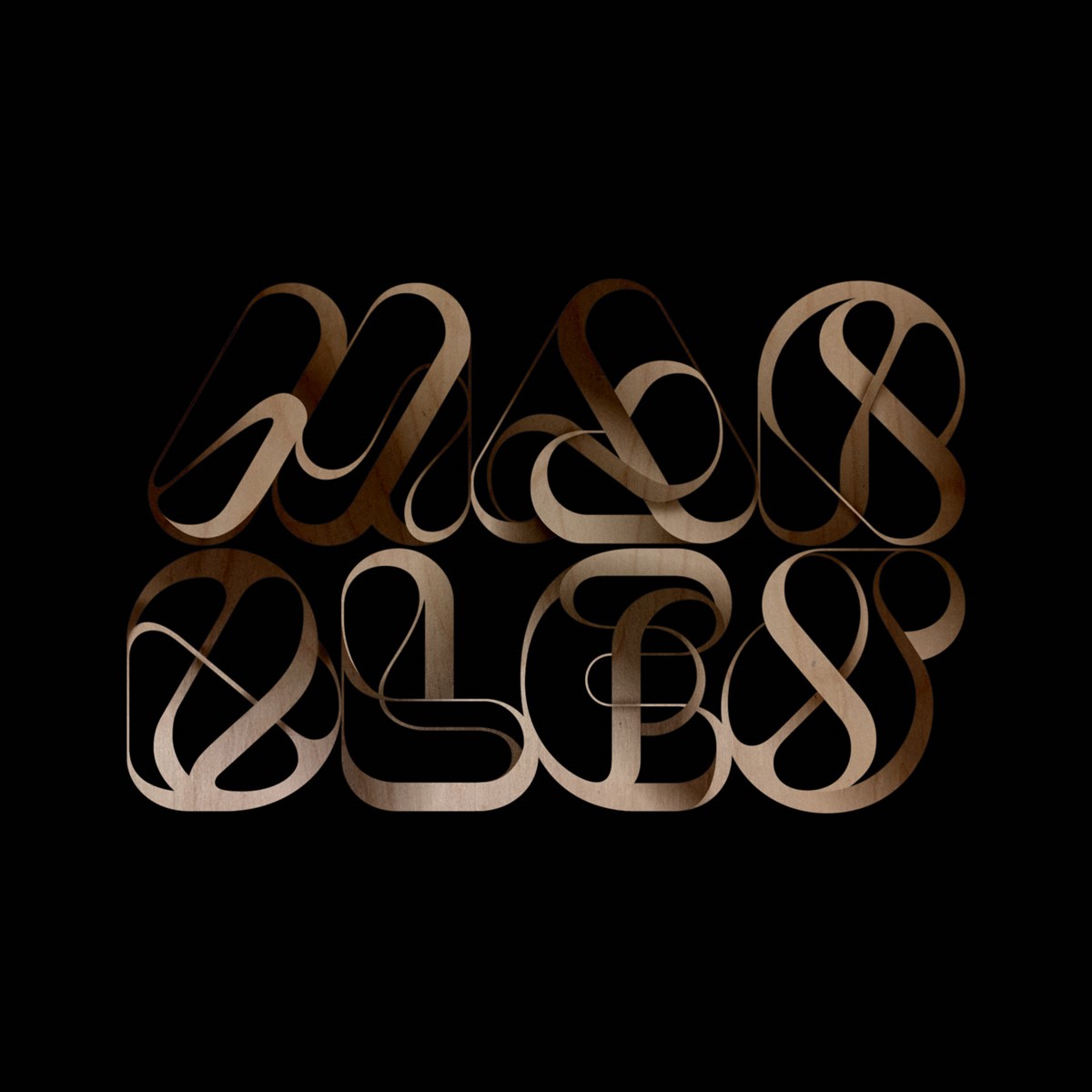
F37 x Superfried Developing Marbles into a typeface
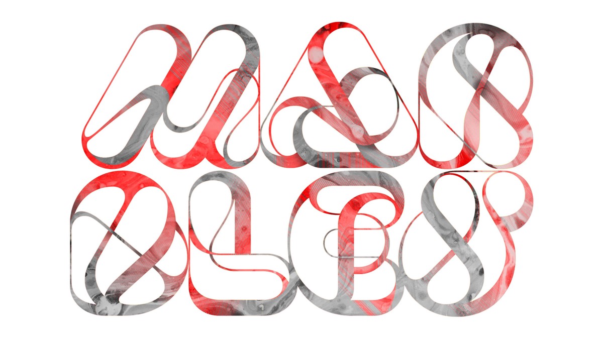
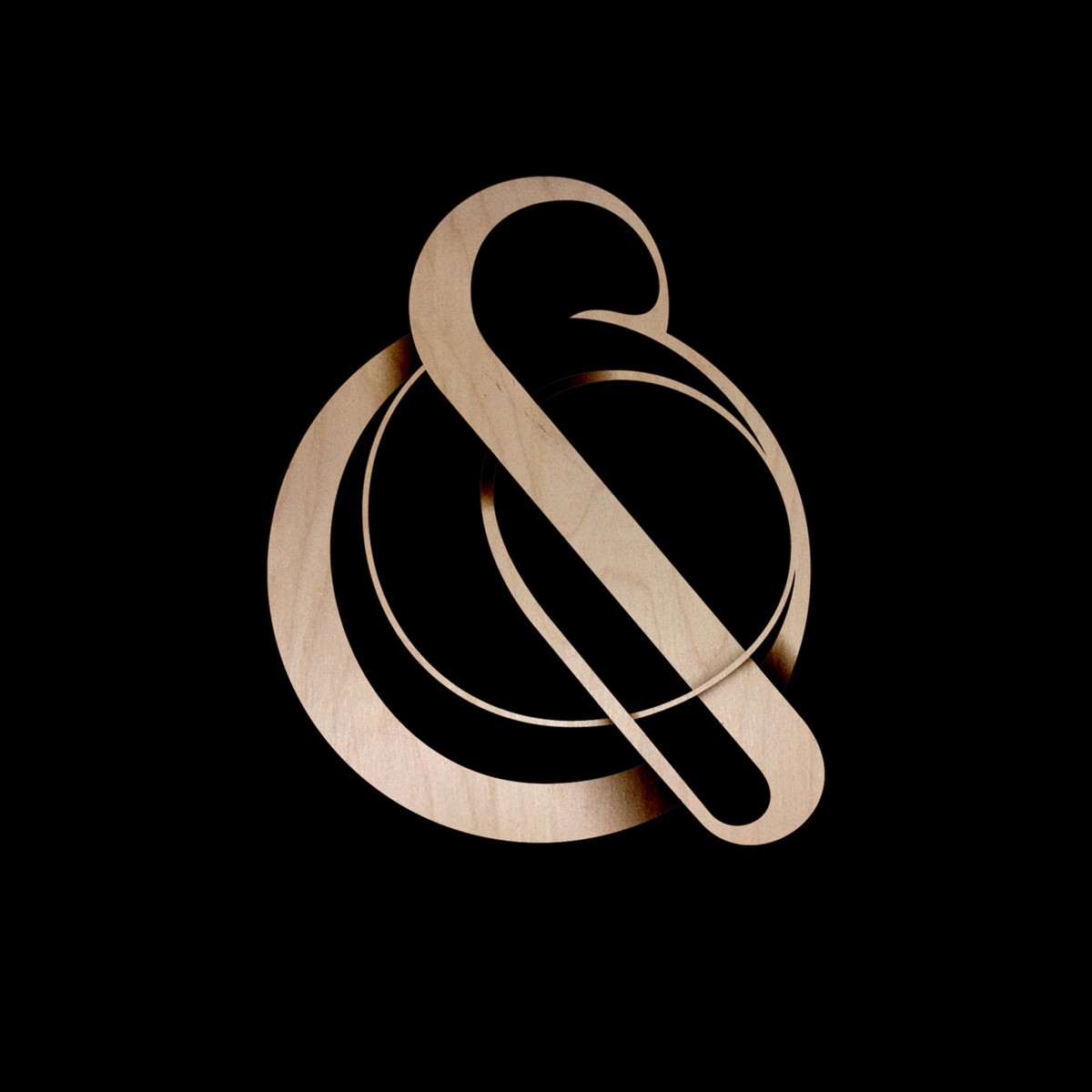
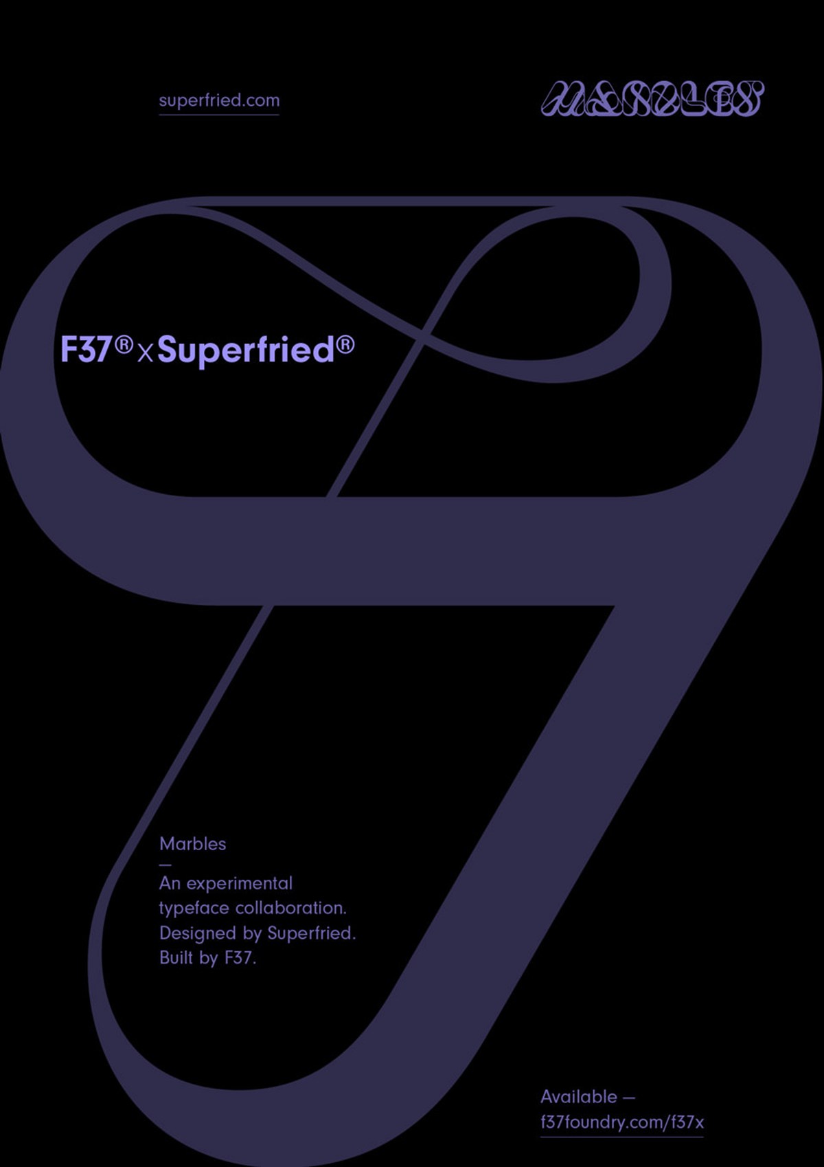
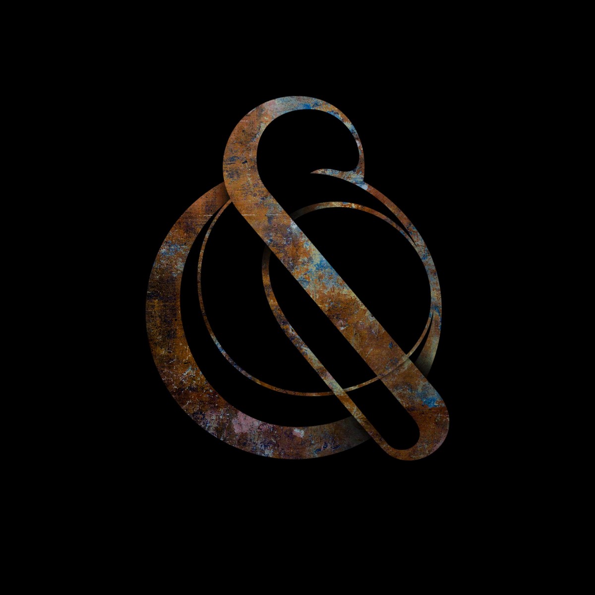
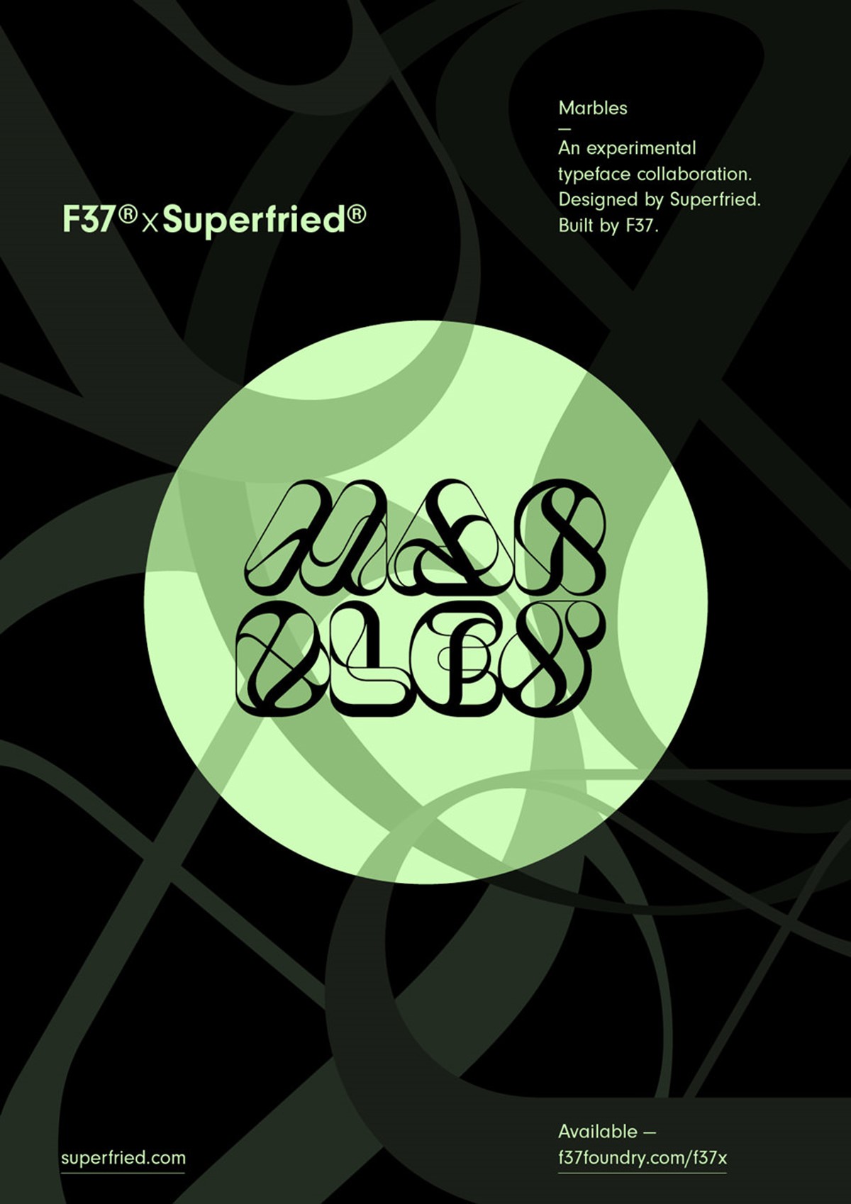
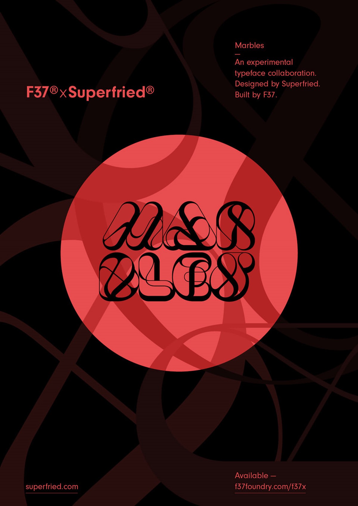
Back in 2016 a little typographic design I proposed for a New York magazine project was turned down. That little idea was recycled and grew into a big personal design project called Marbles. Marbles began as a very organic, fluid experimental set of 2D numerals. Further design experimentation led to 3D renders, the style being adapted for submission to the Secret 7" charity project, numerous press features, and even a Creativepool award for typography. The design experiment truly demonstrated the power of personal projects and to never discard a good idea.
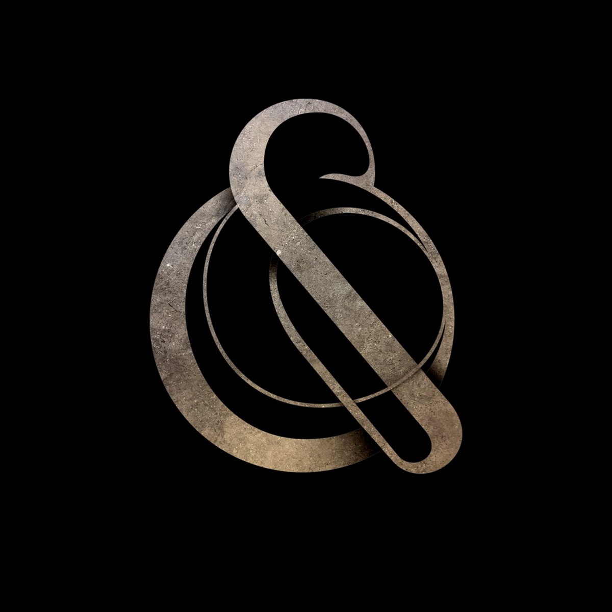
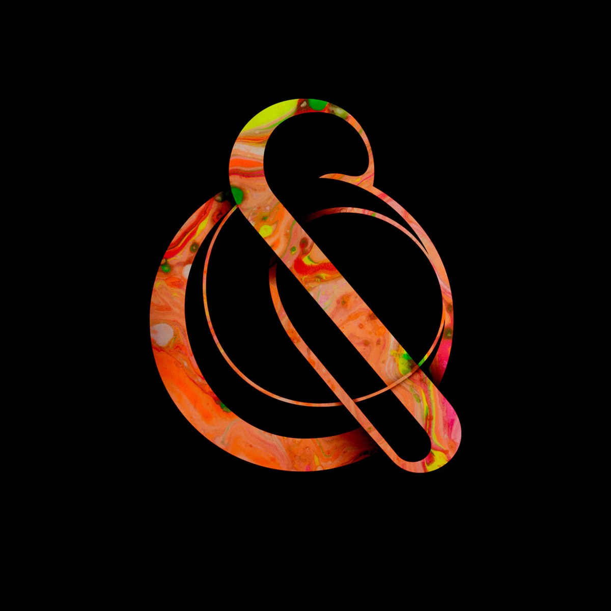
In addition to the numbers, I started to develop some of the letters for the design of a promotional Superfried sticker. But despite this, I had never imagined this typographic design experiment would ever work as an actual typeface since the letterforms were so complex and eccentric.
Seven years later I reached out to Rick Banks – founder of renowned type foundry F37 – re potential collaboration on a project. I had been a fan of both his design agency and type foundry for many years. I was unaware that they were in the process of developing a new offering – F37x. For this new collaborative project, F37 develop the typographic designs, and experiments of external creatives to complete typefaces. Rick suggested that Marbles could be a suitable candidate. I was completely shocked, but immediately jumped at the opportunity.
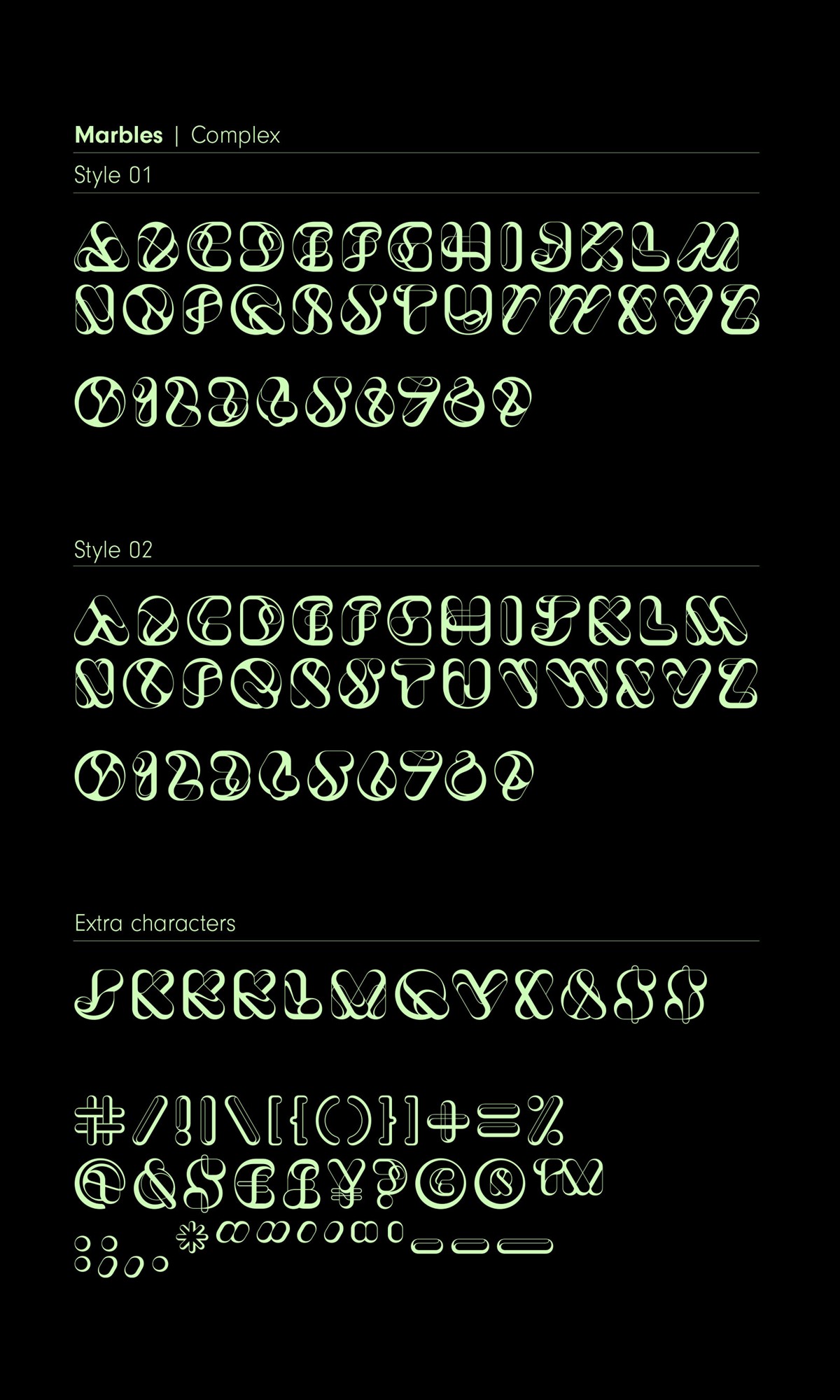
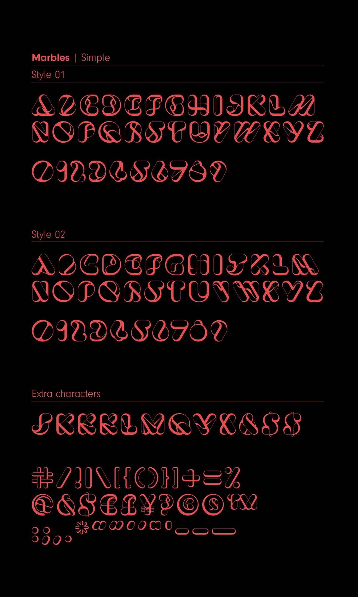
I was quickly working with one of their team – Rodrigo – who made the design process very simple. While creating the additional glyphs, it became clear there were numerous ways they could be re-drawn. In the original numerals, there was a complex and simplified route, so two styles were developed, the latter being more practical for use at a smaller scale.
As the build progressed, so did the volume of potential design iterations for the glyphs. Since the typeface would be solely uppercase, we gained a completely unused lowercase. With this in mind, it was decided that we should create a secondary set of characters for each typeface – four design styles and two typefaces.
Capitalising on the opportunity to add additional styles and glyphs led to an extremely versatile typeface family which allows the user to truly experiment – reflecting the personality of the original design concept back in 2016.
Project services
- Bespoke Typography
- Graphic Design
- Animation
Testimonials . Press . Awards
The new typeface has been featured on Creative Boom, Creative Review, and made the top 5 of Design Week's favourite typefaces for 2023.
The original project this typeface was based on has been featured on various design sites including the new typography section of the Creative Review blog, Behance, HOW, Type Worship, TypeRoom, Creativepool, Dsgn News, and Riensche. It has also been featured in Computer Arts magazine [Aug/2016 – article shown] and PRINT Magazine [Fall 2016].
A charity design submission for Secret 7", based on the Marbles bespoke typographic design was also featured in the internationally renowned graphic design publication IdN Magazine [IdN v23n3].
In addition to the positive press, this typographic design project was also awarded best of Typography in the 2017 Creativepool Annual Design Awards.
Credits
Typeface Design – Superfried
Typeface build – F37 | Rodrigo Feunzalida