10 Top Tips
Designing for the environment
–
Hi, Mark here from Superfried, a design agency in Manchester. I seek projects with progressive, eco conscious clients working towards sustainability development. The green sector covers a wide range of disciplines, so when selecting a graphic design agency it is reassuring to know if they have experience in your specific area of expertise.
Over the years Superfried has developed design and brand strategy solutions for numerous green sector companies and organisations. So, here is an overview of our extensive variety of green projects.
- –
- 01 Climate change
- 02 Endangered species
- 03 Food security
- 04 Ocean protection
- 05 Sustainable shopping
- 06 Waste management
- 07 Circular economy
- 08 Conservation
- 09 Agriculture
- 10 Animal trafficking

01 Climate change – One Earth
One Earth is a highly respected Philanthropic non-profit organisation focused on biodiversity loss and climate change. In addition to raising donations to fund key green projects, they have also developed educational tools such as One Earth Navigator. This allows users to discover detailed information on bioregions anywhere in the world via the Google Earth platform. But One Earth has gone one step further. With so much debate about the severity of climate change and the best way to tackle it, they decided to find their own solution. In an unprecedented move, they commissioned 17 leading experts to develop an actionable model to maintain temperature rise to 1.5˚C. The result was a piece of highly respected research that provided a strong action plan and sector-leading USP.
However, they faced a common issue within the environment industry – the problem and solution can be very technical. This can render content far too detailed and daunting to be easily digested leaving messages unheard, misunderstood, or simply ignored. Design agency Superfried worked with One Earth to develop a brand strategy to create a hierarchical, streamlined approach for their eco messages. Employing graphic design styles to segment and simplify content greatly enhanced the potential for true engagement. In addition, their existing graphical communications and brand colour palette was developed further to enhance the appeal and clarity of their green messaging. Finally, bespoke typography was created for their logotype to increase their brand distinction and accompany the retained brandmark.
References
-
One Earth – Philanthropic non-profit organisation
One Earth
Philanthropic non-profit organisation
-
One Earth – Navigate the Earth's bioregions
One Earth
Navigator
-
One Earth – Superfried – Case study
One Earth
Brand strategy by Superfried
02 Endangered species – Jane Goodall Institute | LEAF
As one of the world’s most famous conservationists and scientists Dr Jane Goodall rarely requires an introduction. Since she started her pioneering research of wild chimpanzees in 1960, Jane still spends over 300 days a year on the road committed to conservation, research, and education.
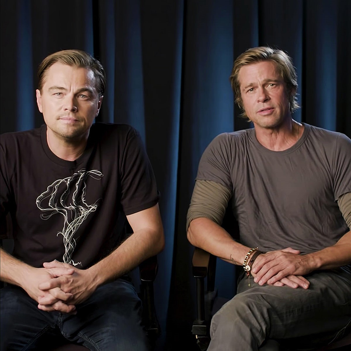
To raise awareness of the devastating impact caused by deforestation on global ape populations, her organisation – the Jane Goodall Institute – joined forces with the DiCaprio Foundation. They approached creative agency Superfried to develop the design solution, branding strategy, and promo animation for a t-shirt flash sale campaign in association with Represent.
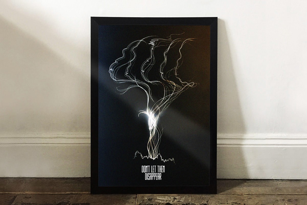
However, this was easier said than done as the campaign had to represent five separate species – Gorillas, Chimpanzees, Orangutans, Gibbons, and Bonobos. This was a complex problem to solve, but possible via design experimentation to an innovative solution.
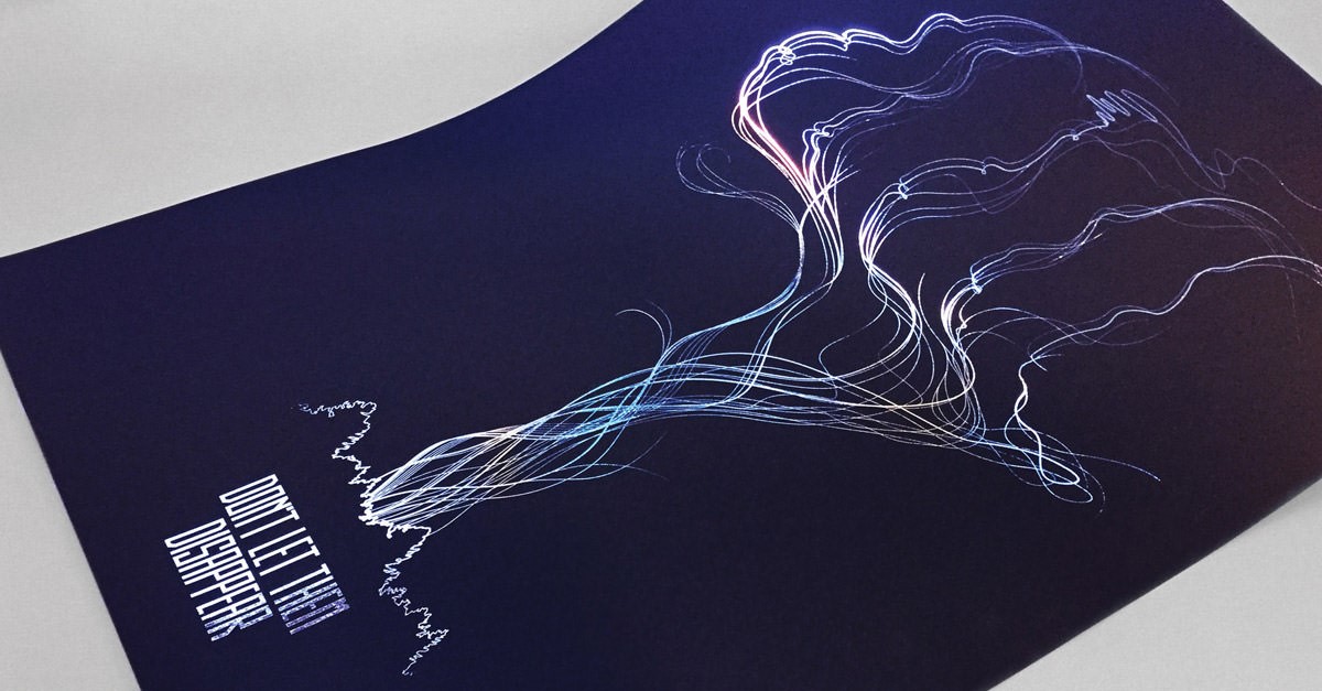
Research and testing led to an intricate illustration style resembling smoke emanating from a forest fire. The intertwining paths presented the freedom to create a likeness of the five endangered apes within the smoke. In addition to the planned t-shirts, the inclusion of printed posters and animation for social media was proposed to optimise engagement. To ensure longevity should they wish to conduct further campaigns, bespoke typography was developed for the campaign brand logotype – Don’t Let Them Disappear. The design project was a great success helped by photos circulating on social media of Leonardo DiCaprio wearing the t-shirt sat next to Brad Pitt.
Superfried has also worked on another endangered species project. On this occasion, it was for the Leuser Ecosystem Action Fund [LEAF]. The DiCaprio Foundation partnered with the Sumatran Orangutan Society [SOS] and established a fund to protect critically endangered species and habitats on the Indonesian island of Sumatra. It is only here in the Leuser Ecosystem that orangutans, rhinos, elephants, and tigers still coexist in the wild. Graphic design agency Superfried was appointed with the task of developing their branding strategy.
With four very different species involved, my initial thoughts were to simplify the problem via the use of bespoke typography rather than graphical representations, playing on the very apt acronym – LEAF. However, the results did not sufficiently resonate with what was truly at stake. The creative strategy was reviewed and refocused on the four animals. To feature all four species would be a severe challenge exacerbated by their heterogeneity. There was no commonality to grasp amongst them or a distinct illustration style that would suit all.
To maintain a suitable tone and animal recognition a simpler silhouette style was adopted. Space would be limited, so the illustration styles were subsequently overlapped, alternating between black and white, leading to a more concise footprint for the brandmark.
With such a long name, the logotype design was also challenging. However, the strong acronym was useful when combined with the name in full, in vertical and horizontal compositions. This approach worked in isolation or within a horizontal logo lock-up. But, it would be impractical at small scale, so a roundel design was also developed.
For marketing purposes, there was no budget for photography, consequently, research began via Unsplash. To my surprise striking portrait shots of each species were available. The unusual poses gave the protagonists an almost human quality, like they were waiting for an answer to a question, drawing the viewer in, and creating a connection. The photos were recoloured to reinforce a consistent, powerful brand position.
Upon completion, the design project was well received winning an award for branding in the Creativepool Annual and was featured by leading design industry sites Design Week and Behance.
References
-
Jane Goodall Institute – Don't Let Them Disappear
Jane Goodall Institute
Don't Let Them Disappear – by Superfried
-
Jane Goodall Institute
Jane Goodall Institute
Website
-
Sumatran Orangutan Society – LEAF Fund Brand Strategy
Sumatran Orangutan Society
LEAF – Branding by Superfried
-
LEAF – Website
LEAF
Website
-
Sumatran Organgutan Society – Website
Sumatran Organgutan Society
Website
03 Food security – Marlow Ingredients a new division of Quorn
Food security is a major global concern. This has been the case since the 60s when the founder of Quorn, Lord Rank, embarked on a mission to develop a sustainable food protein to feed the world. This was a bold ambition, but thousands of soil samples later, the fungi family Fusarium venenatum was discovered in 1967 in the small town of Marlow in Buckinghamshire. Research and development continued to perfect a natural fermentation process, which led to the commercial production of mycoprotein, better known as Quorn, in 1985.
Now the market leader in the production of non-meat protein for over 40 years, Quorn can grow a staggering protein equivalent of 3,000 cows a week. In that time much has changed. There is now a far greater appetite for a more eco conscious diet. Consequently, the non-meat protein sector has grown and evolved rapidly to accommodate the demand. Reflecting on Lord Ranks’s original, global ambitions, if they could supply mycoprotein as an ingredient to other food producers, the potential benefits to food security and the environment could far surpass the efforts possible by Quorn alone. Design agency Superfried was approached to work with Quorn to develop the name and branding strategy for their new ingredients division.
Through their extensive experience and research, it has become apparent that the potential for mycoprotein as an ingredient is endless, far surpassing the food industry. It was therefore essential that the new name was not restricted to their current sector. An exhaustive client collaboration proceeded with over 40 potential names being tested thoroughly. In a crowded, evolving market this was no longer a simple task. The initial direction had focused on an aspirational future, but it was then re-directed back to Quorn and their USP. What made Quorn unique was how and where it all started in Marlow. Marlow Ingredients was born.
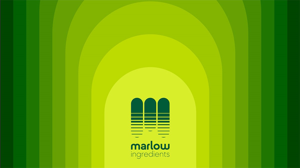
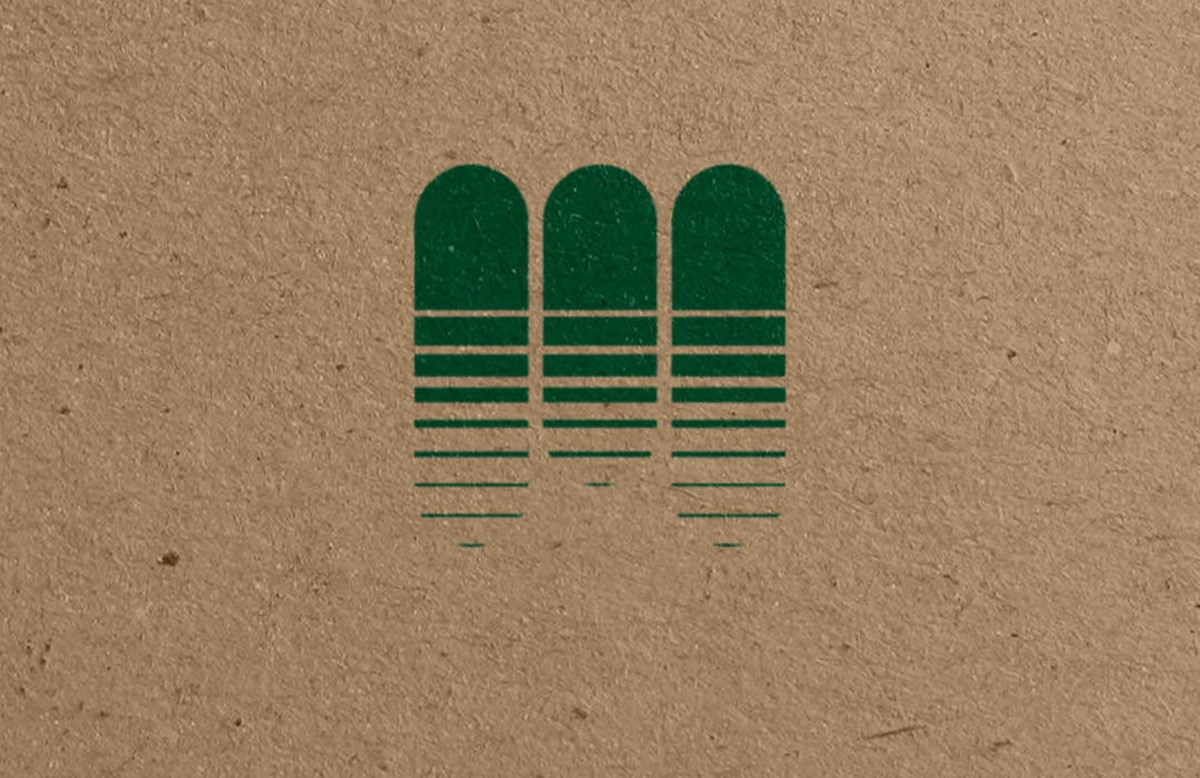
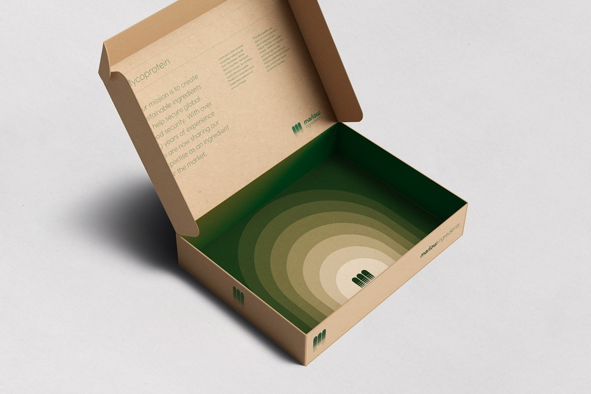
For the remainder of the brand development, I continued the focus on Quorn and the natural process by which they grow mycoprotein – fermentation. This takes place in vast, vertical cylinders, the shape of which could be developed into a graphical representation of the process and simultaneously suggest the presence of a distinct, abstract M. The simple design solution would comfortably relate to their name, their process and remain suitable for any future sectors they wished to explore. The brandmark also helped to direct the styling of the bespoke, wordmark and accompanying graphic language.
Since completion, Marlow has secured their first partners and is in active discussions with other potential customers throughout Europe. Mycoprotein is an established non-meat protein, but the team is already exploring how mycoprotein can solve challenges in industry sectors far beyond food as they continue to work with Superfried design studio to develop their brand identity.
References
-
Marlow Ingredients – Brand identity by Superfried
Marlow Ingredients
Brand identity by Superfried
-
Marlow Ingredients – Website
Marlow Ingredients
Website
04 Ocean protection – Leonardo DiCaprio Foundation
The environmental health of our oceans and the species that reside within them is essential if we are to maintain a sustainable future on our planet. Design studio Superfried worked on two projects in this specific field with LA-based, non-profit organisation – Leonardo DiCaprio Foundation. Established in 1998, the non-profit has raised awareness and donations of nearly $100m for key environmental causes. In 2021 they joined forces with Global Wildlife Conservation to launch re:wild.
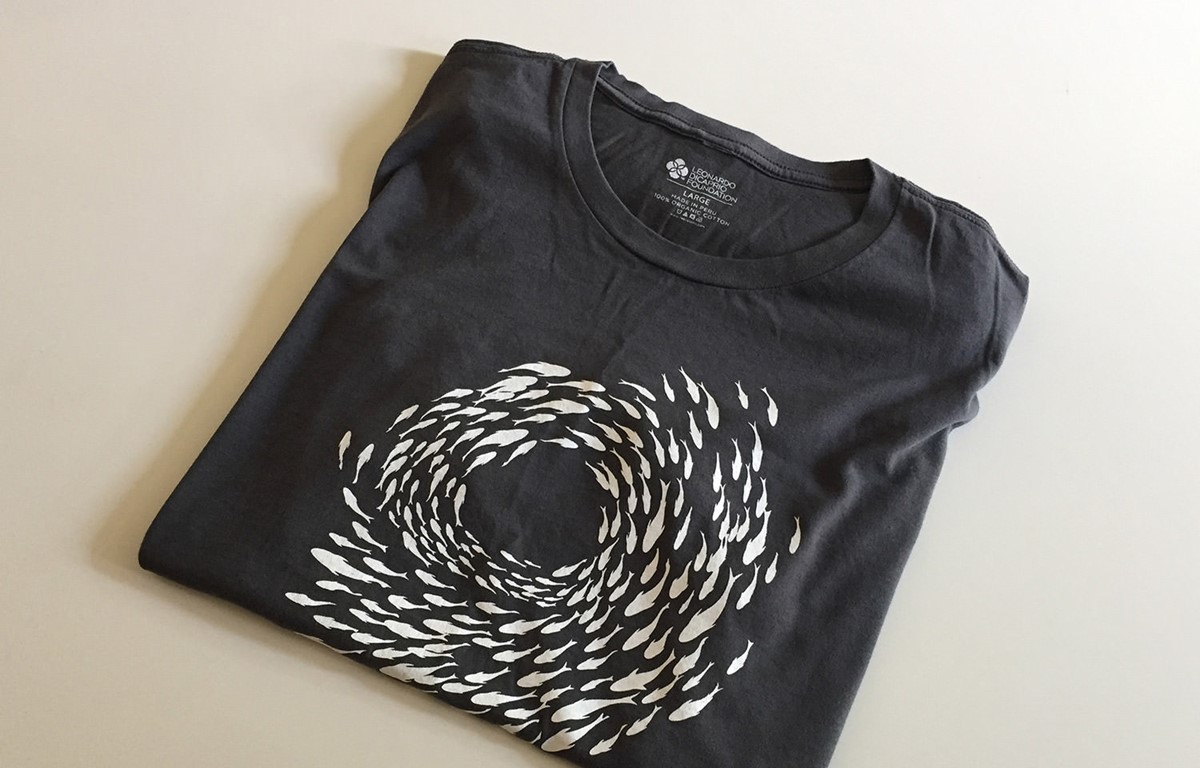
The DiCaprio Foundation wanted to capitalise on World Ocean Day to raise awareness and essential funding for the conservation of sea life. They required a t-shirt design for a limited edition two-week flash sale. During the research stage, one of the reference images supplied by the client featured a rotating shoal of fish. I was immediately drawn to the calming, organic yet geometric form.
The campaign was focused on the general health of oceans rather than a specific species, so the initial fish designed for the illustration was deliberately generic. A quick mock-up via duplication was approved, but it would require work to feel more organic. Unfortunately, there was no shortcut to achieve this, so each fish in turn was tweaked and adapted to ensure it was unique in some way, as it would be in the wild. Although laborious, the process had the desired effect, immediately transforming the feel of the illustration despite the minimal, silhouette style.
The final organic t-shirts created by Represent were of great quality and the flash sale was successful. It was particularly rewarding to see it worn by practitioners and experts within the field including Enric Sala, National Geographic Explorer-in-Residence, and Mr DiCaprio himself.
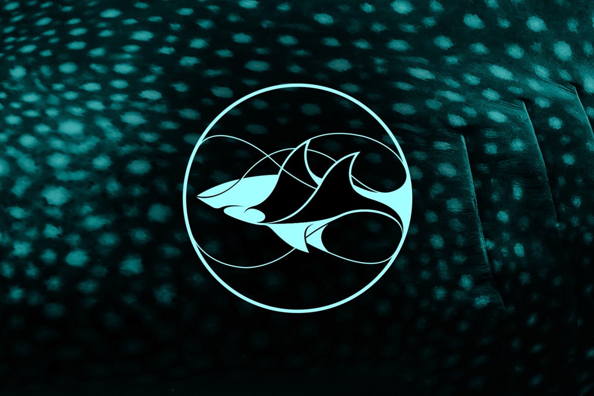
Another project in this field also came through the Dicaprio Foundation. The organisation had established a new fund for the conservation of Sharks and Rays. They required a brand identity before they could commence with fundraising and their brief was rather challenging. The client requested that the brand marque simultaneously represent Sharks, Rays, and their natural habitat since they would be protecting all three. Most of the time, trying to convey so much information via just one logo would be unwise and lead to a confused or diluted message. But occasionally things just fall into place. Leveraging the similarity in the form of waves and fins, combined with some negative space graphic design trickery enabled me to fully deliver on their bold request.
The client was thrilled and the response has been overwhelmingly positive. The project received a branding award and was featured by numerous industry-leading design sites such as Creative Review, Creative Boom, Design Week, Dezeen, Behance, Logo Designer, Transform magazine, and Design Taxi. To date, the Shark Conservation Fund has conducted 125 projects with 87 partners in 65 countries.
References
-
Leonardo DiCaprio Foundation – World Oceans Day illustration by Superfried design agency
Leonardo DiCaprio Foundation
World Oceans Day – Illustration by Superfried
-
Shark Conservation Fund – Brand identity by Superfried
Leonardo DiCaprio Foundation
Shark Conservation Fund – Branding by Superfried
-
Shark Conservation Fund – Turning the tide for threatened sharks and rays around the worl
Shark Conservation Fund
Website
05 Sustainable shopping – Ethy
With sustainability and eco living, I feel it is important to also consider practicality. If we preach to everyone and constantly make them feel guilty for every action they will simply switch off. Ultimately we still need to live and to do so unfortunately requires us to shop. For anyone trying to embrace eco living, this is one of the most challenging areas to navigate. How do we find eco friendly products which use biodegradable packaging? Which are the most sustainable products? What does all the terminology mean? Can we trust their eco credentials?
Superfried client Ethy decided to address this problem. They developed a free app that enables consumers to locate ethical, environment first eco shops throughout the UK. To remove any element of doubt or mistrust Ethy has established a stringent verification process for all participants based on the 17 United Nations Sustainability Goals. Their solution is so effective because it is guilt-free. Their app makes shopping feel positive because it is helping to grow a more sustainable and circular economy for our future. Their product had already been highly successful, but they now felt it was time to take it to the next level. They hired design studio Superfried to develop a new brand strategy including a new logotype, palette, typography, and graphic language.
References
-
Ethy – Sustainable shopping
Ethy
Sustainable shopping

06 Waste management – Dsposal and YourDsposal
Waste disposal is a big issue. The most effective approach is to re-think what we are creating, how we create it, and why. Ideally, we need to produce less. But for the products we require, they should be designed to be long-lasting and made from sustainable materials with renewable energy. We must ensure we have a plan for the end of their useful life. Can they be reused? Are they biodegradable? Or, as a last resort, can they be recycled? However, life is never that simple and we still have a lot of existing waste. It is always important to make the best of a bad situation, so what is the most ecological way of managing it?
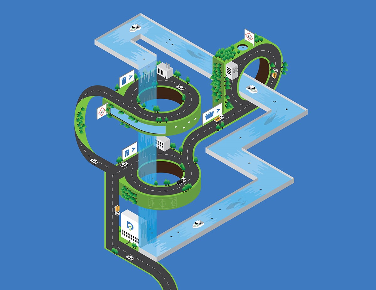
This was a constant issue companies faced – where to take the materials and who to trust to process them ethically. With this in mind, Sophie Walker and Tom Passmore developed an online hub – Dsposal – to connect waste producers with registered waste management companies. To communicate this struggle, fun, vibrant illustrations of a complex, surreal world were created to show how they can help their customers navigate a way through to the right, registered, sustainable partners.
The client had referenced a classic piece by Escher – Waterfall – featuring an infinite aqueduct. The continuous stream resonated with their philosophy there is no such thing as throwing waste 'away', it goes somewhere or comes back to haunt you with a fine. This was a dream come true since Escher is my favourite artist.
With the reference in mind, I created a fantastical, isometric world within which Dsposal directed customer, waste-laden trucks through to the right waste management green partners, while Environment Agency boats tackled the flip-tipped waste within the forever stream. It was also possible to include some fun features within the minuscule world such as a vertical football pitch, a helix-based road, daunting boat-sized fish and a few sheep.
The platform was successful, but they noticed substantial traffic from domestic users. Consequently, it would be more effective to create a separate, domestic hub to cater to their specific requirements. YourDsposal was born and design studio Superfried was recalled to develop a new brand identity and illustration.
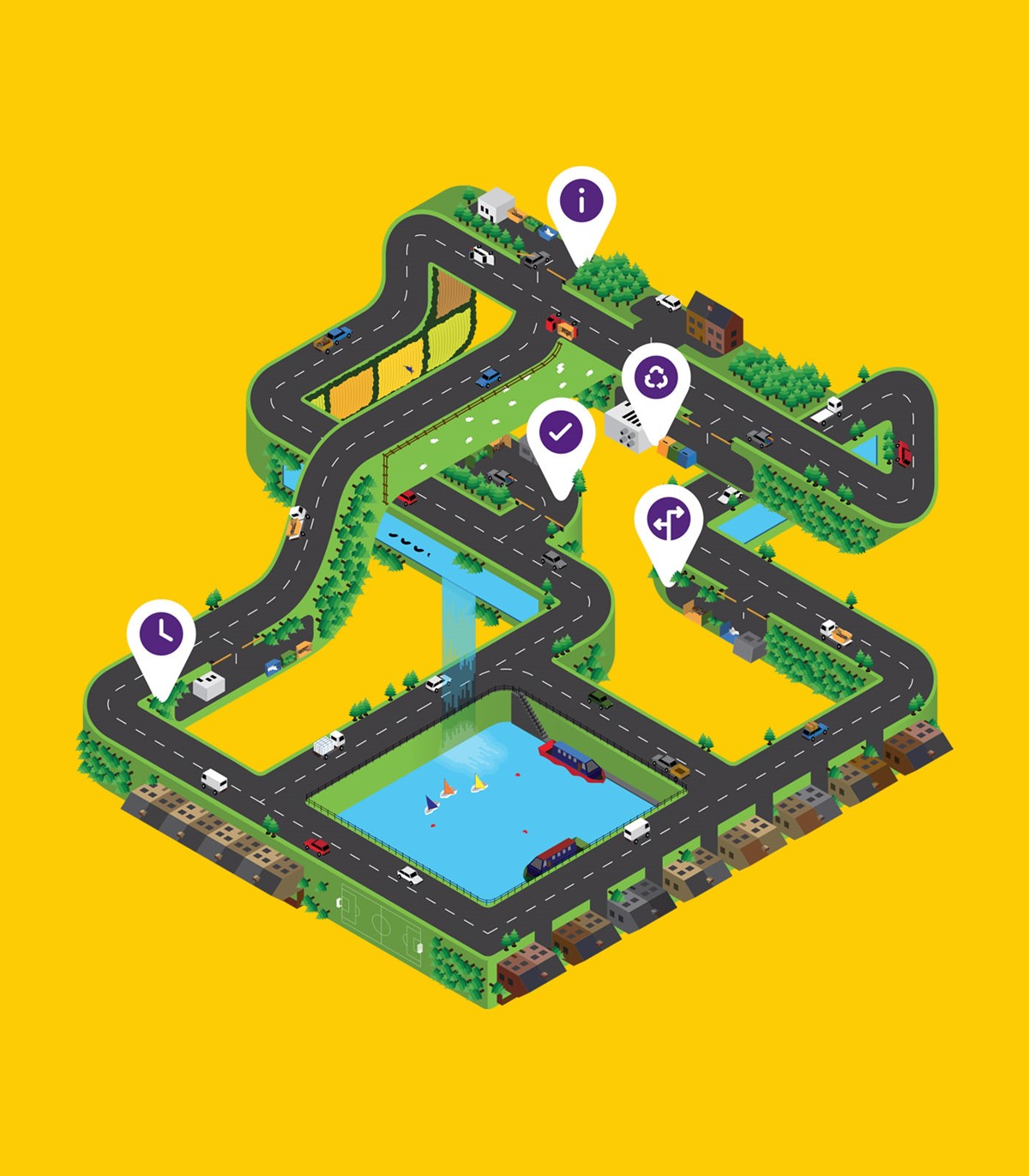
It was essential to avoid any confusion between the new hub and the existing brand identity. Achieving this would require a direct strategy and approach that immediately conveyed the service provided and who it is for. With this in mind, the most literal symbol for domestic life is a house and for waste, the classic bin icon – both commonly adopted on every digital screen. During the research, it became apparent that the rubbish bin could potentially resemble the entrance to a home, leading to a strong, logical, and descriptive graphic solution.
With brand consistency in mind, the surreal isometric world approach was adopted once more for the new illustration. But on this occasion, the location was more urban to align with the target domestic audience.
For the brand palette, the green was retained to maintain a connection to the commercial hub. Instead of the original blue, adjacent citrus tones from the green led to a vibrant yellow. The tricky, secondary brand colour was resolved via the use of the opposite colour theory for high contrast. This approach directed us to a strong, vibrant purple.
References
-
Dsposal – Waste Management Software for All
Dsposal
Website
-
Dsposal – Brand-led illustration by Superfried design agency
Dsposal
Brand-led illustration by Superfried
-
YourDsposal – Licensed disposal of household waste
YourDsposal
Website
-
Your Dsposal – Brand identity and illustration by Superfried design agency
YourDsposal
Brand identity and illustration by Superfried
07 Circular economy – WasteAid
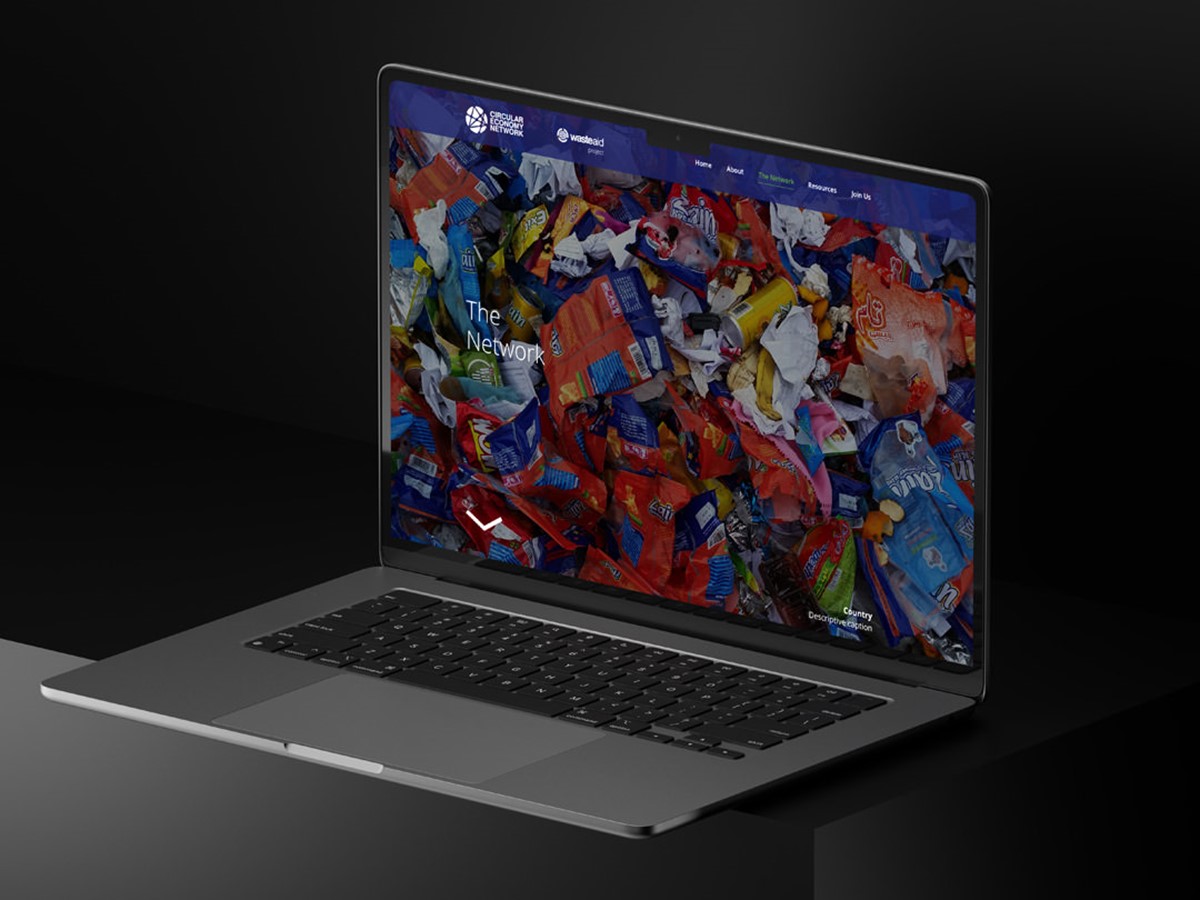
There is no doubt that for a successful and sustainable future, we will need to adopt a more circular economy. To drive this ambition, UK-based charity WasteAid was offering funding to help new companies with innovative solutions to waste management in three key locations – Vietnam, India, and South Africa. They had a website in place for the project, but ineffective web design was struggling with the high content volume. Design studio Superfried was brought in at short notice to rapidly re-design the website before the project launch event.
It was clear, after analysing the existing site, that there was a lot of information to convey, so it was key to keep it clean and content-focused. But to maintain interest, it was imperative to also add impact. Reviewing the brand identity that had been developed for the site revealed a strong, unused secondary palette and some great photography.
Simple application of the strong palette to the backgrounds established impact without affecting legibility. The available photography was subsequently used to annotate and break up the content. To enhance usability and clarification, additional, bespoke icons and infographics were developed to convey key, essential details. Constant testing and collaboration with their developer ensured page designs worked responsively across all breakpoints and devices.
Refernces
-
WasteAid –Non-profit waste management
WasteAid
Waste management charity
-
WasteAid Circular Economy Network – Website design by Superfried
WasteAid Circular Economy Network
Website design by Superfried
08 Conservation – THRIVE
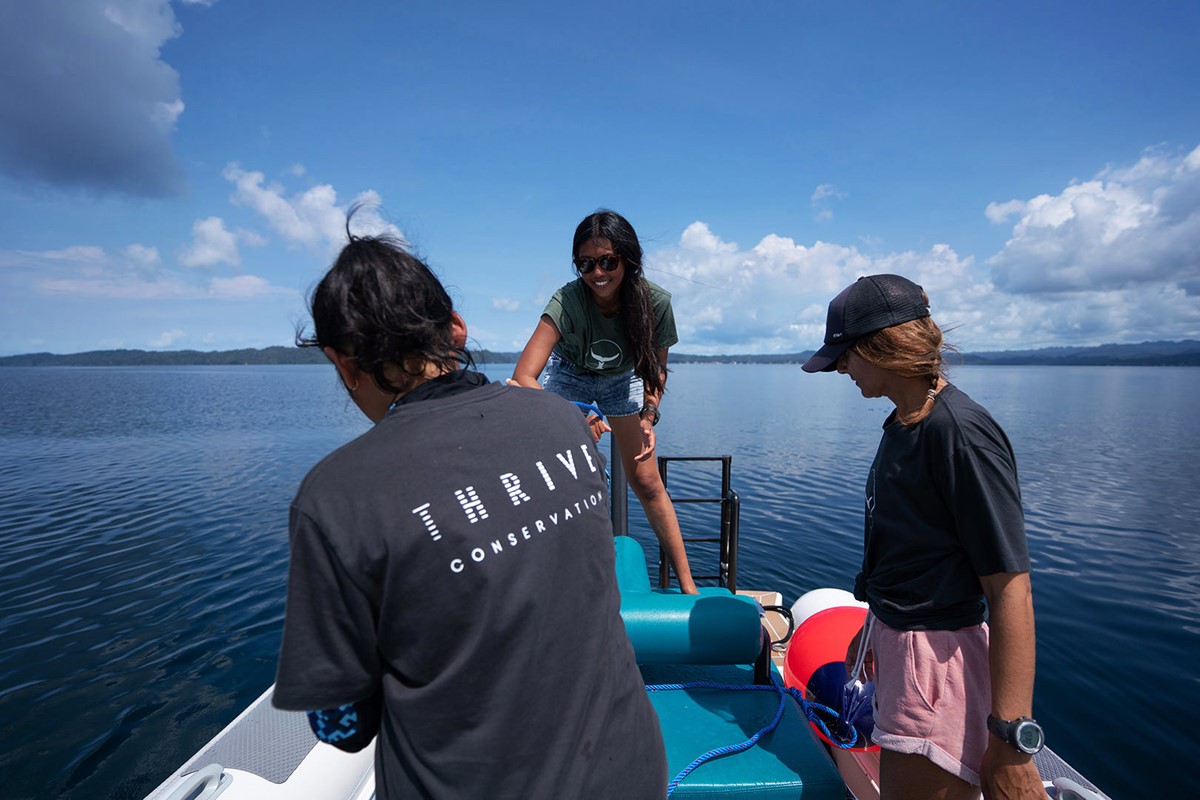
Now we travel to Asia. Originally from the UK, Sarah Lewis, founder of non-profit Thrive Conservation, required help to establish respect and trust in her organisation. Located in Indonesia, small environmental organisations struggle to compete for funding against larger, global non-profits.
Sarah was also frustrated that insufficient funding was leading to significant conservation gaps across the archipelago in remote locations. She had also discovered that the apparent lack of available staff was due to a limited number of jobs in environment conservation rather than disinterest. Consequently, Sarah raised her ambitions even further.
In addition to conservation, Thrive would also focus on the community. Via education, they would establish long-term employment opportunities. With an increase in environment conservation jobs, much-needed staff could be recruited to conduct the work required within neglected, remote locations. This was an untapped niche, but as a small organisation they would still struggle to be taken seriously by large funding groups. Undeterred, Sarah approached design studio Superfried since she believed that professional brand strategy and positioning would reassure donors.
Thrive would be working to conserve all forms of flora and fauna, despite Sarah's background in marine conservation. Working closely with the client Superfried was able to develop design solutions to fit their broader green projects.
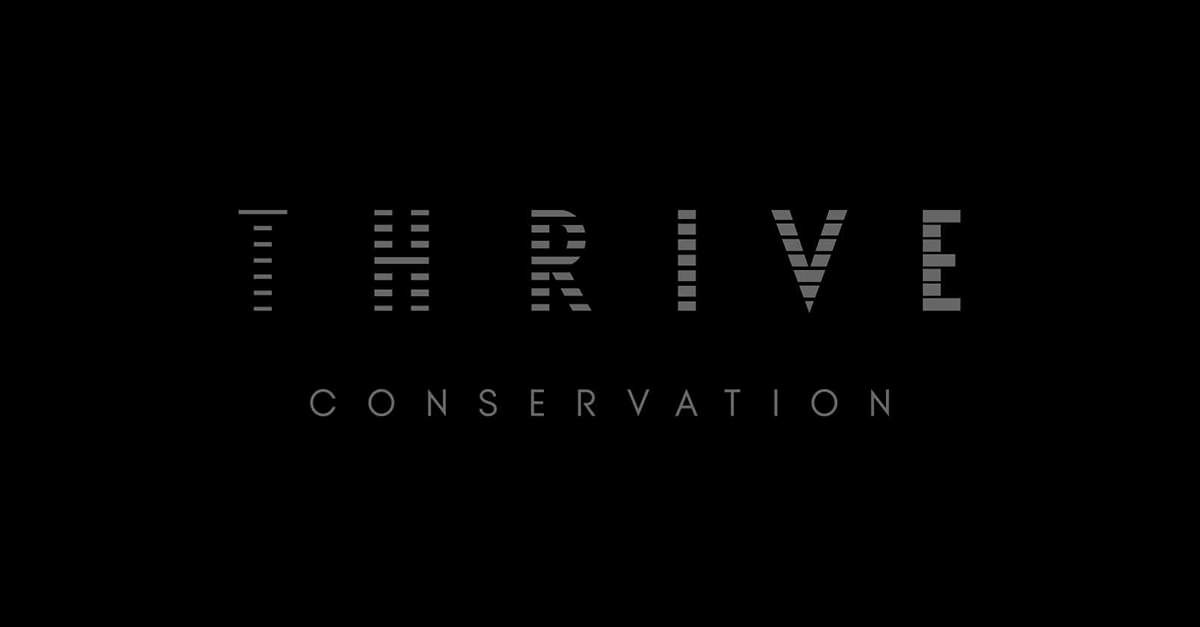
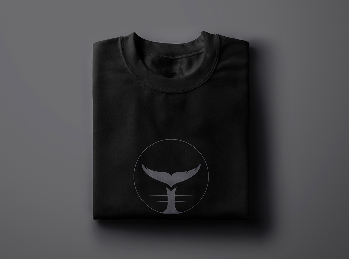
Depending on the observer, the slightly ambiguous logo could resemble a letter T, the tale of a fluking whale, a plant or potentially a bird in flight. Regardless of how you perceive it, the marque is a clear, distinct representation of a natural world they intend to protect. For the logotype, a literal, graphical representation of thriving was explored. Slicing the bespoke lettering into vertical strips of increasing width, it was possible to convey a sense of growing in strength and number over time.
The brand identity was bold and confident but required testing. During this process, there were concerns regarding the use of the graphic marques at scale. To address this, simplified and detailed versions of the logo and logotype were developed. Additional lock-up compositions were also designed to cater for changes in aspect ratio. Typeface selection, information styling, and graphic devices were subsequently developed for the design of marketing collateral, a proposal deck, and an animated logo ident for use with video content. With the deliverables in place, Superfried then carried the new brand identity system across into a new web design for their existing site.
Sarah's bold plan worked. With the brand identity in place, it enabled Thrive to attract funding, grow, and tackle the conservation issues that had been consistently neglected. In addition to funding, since the completion of the branding process, Thrive has grown and recruited several new conservationists to the team.
References
-
Thrive Conservation - Brand identity by Superfried
Thrive Conservation
Brand identity by Superfried
-
Thrive Conservation – Nurturing the future of our planet
Thrive Conservation
Website
09 Agriculture – Tautenay
One of the areas often overlooked is farming and agriculture. It just continues doing its thing, rarely featuring in the headlines until there is a bad crop or a cattle virus outbreak. Yet this sector is incredibly wide, varied and vitally important. As we continue to change our eating habits, see signs of more unpredictable weather patterns and fear of soil degradation increase this could be where we see the biggest changes of all.
Tautenay are consultants to the governments of the UK and Channel Islands on agriculture and the environment. They approached Superfried for a rebrand to take their consultancy to the next level. From the outset, it was clear that tone of voice would be key, to strike a fine balance between their two audiences – government officials and practitioners in the field.
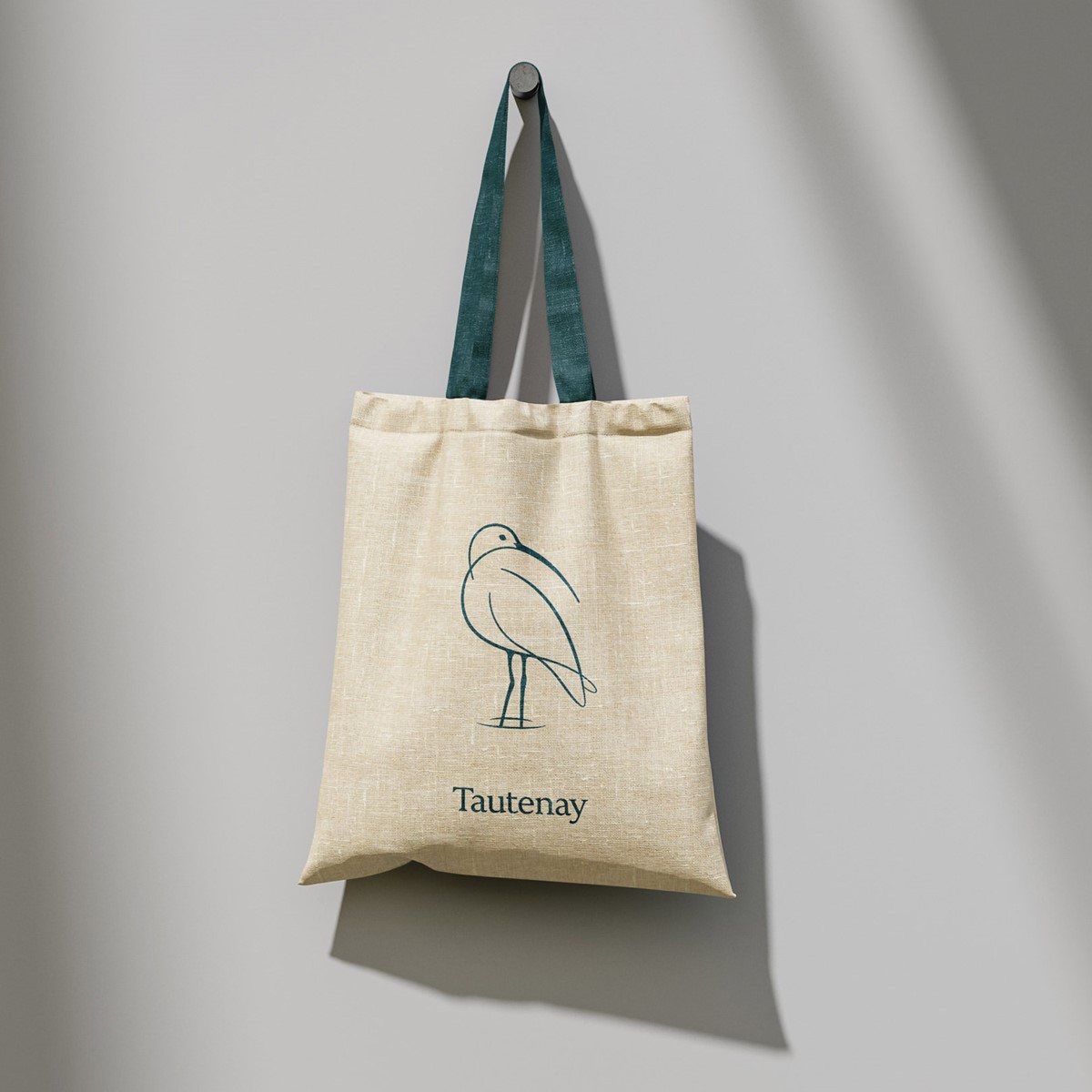
For a sense of gravitas, experience and credibility a serif typography was employed. But to ensure they remained approachable the letterforms were heavily crafted into a bespoke wordmark, softening the sharp, stern feel that can be a common trait of a traditional serif.
The logo marque would provide an additional opportunity to reinforce this balance. Their projects are located both on land and at sea, so neither could be excluded. After much research, it was the client's suggestion of the very distinctive, coast-dwelling Curlew that provided the perfect solution. For our protagonist, a truly distinct, fluid style to compliment the adjacent bespoke logotype was adopted. In keeping with the environments within which they work – and the UK weather : ) – a calm, muted palette of blues and greens was selected to be applied across all brand-led material and templates.
References
-
Tautenay – Brand strategy by Superfried
Tautenay
Brand strategy by Superfried
10 Animal trafficking – Rhino | Pangolin
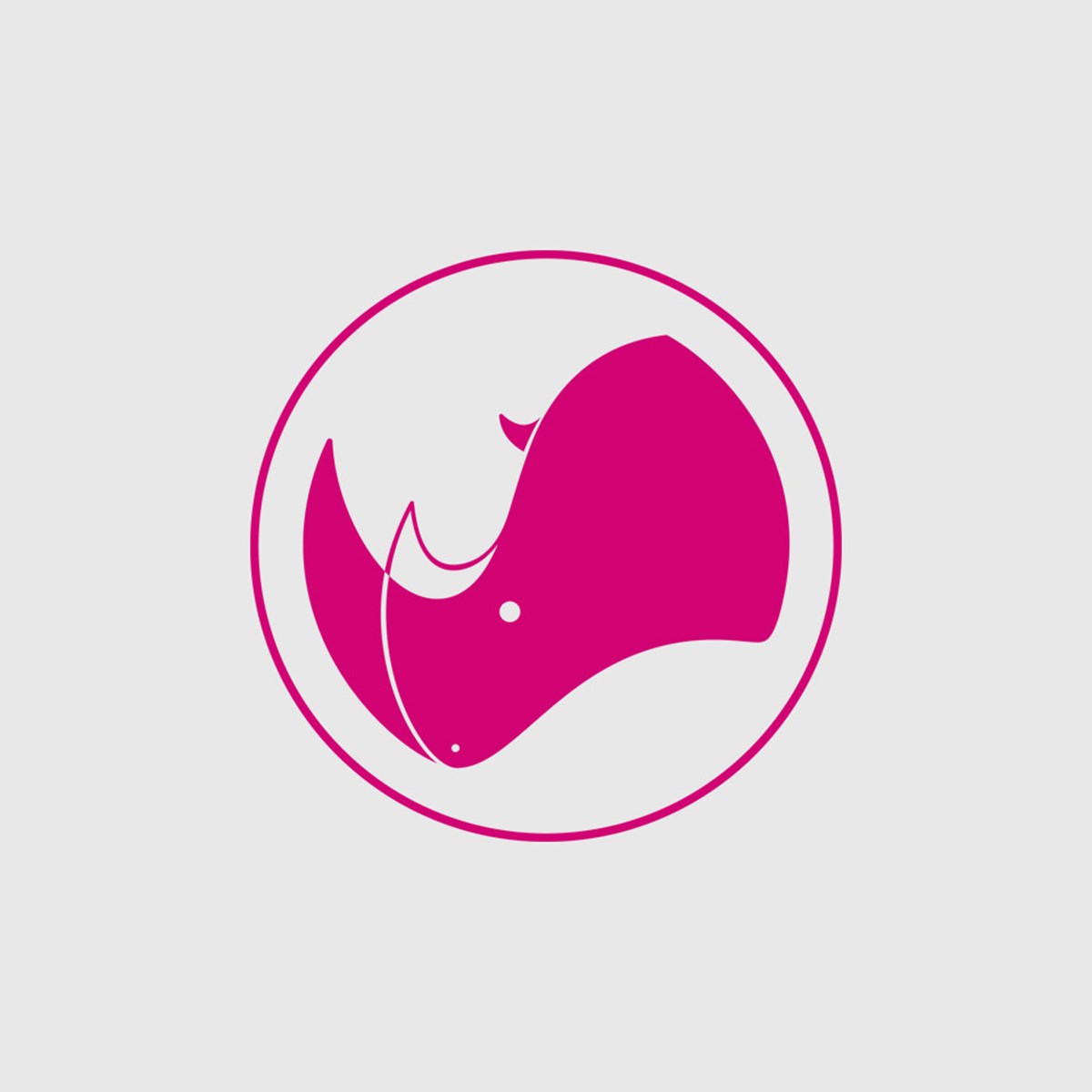
One of the most disturbing scenarios within the realm of conservation is animal trafficking. Such a senseless and brutal act. Superfried worked on two projects of this nature with SanFran-based Wildlife Conservation Network [WCN]. The first was to develop the brand identity for a well known trafficked species – the Rhino. As to be expected the client the brand marque to include a Rhino. Research revealed there are a lot of rhino logos out there, but the vast majority use a realistic interpretation – therefore a stylised impression was the way to go. Unfortunately, this was more difficult than expected. Rhinos are rather peculiar-looking creatures, so the stylistic interpretations often failed the recognition tests. But with dogged perseverance a unique, passive, geometric solution was found. Today it is great to see that the fund is backing 62 projects across 13 countries.
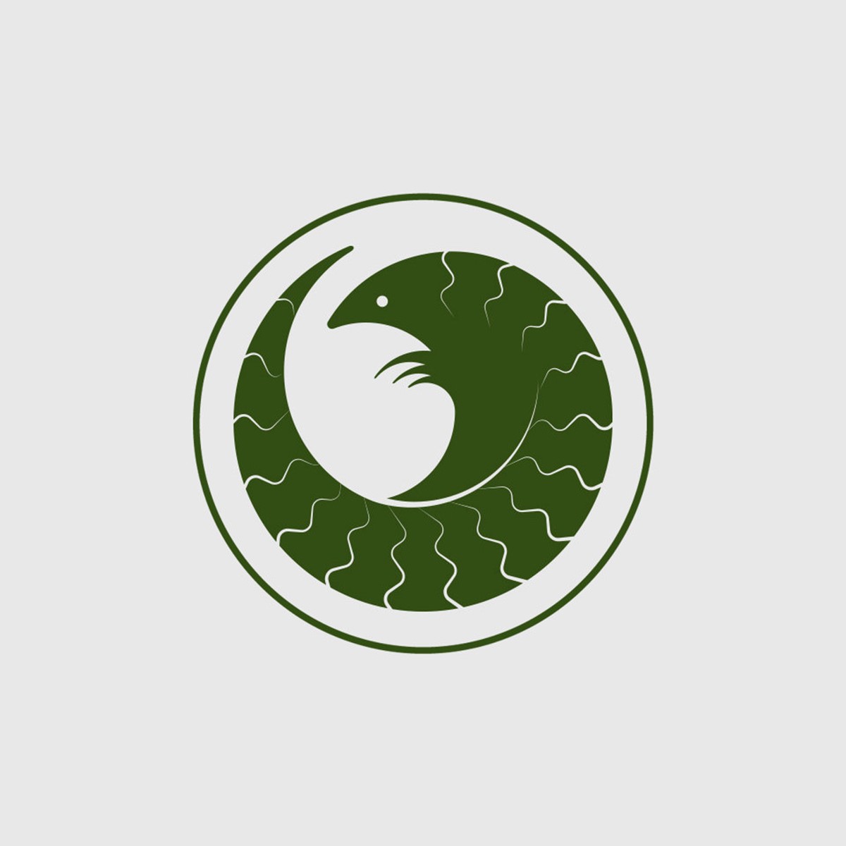
The protagonist for the second project with WCN is actually the most trafficked species in the world – the equally strange, but adorable Pangolin. The fund was established to prevent poaching, since their meat is perceived to be a delicacy and their scales are falsely believed to have medicinal qualities.
For brand consistency, inline with previous funds the logo container would be a circle. This was particularly apt since Pangolins naturally curl up into a ball. Aside from this their most distinct feature are their scales. But although beautiful, they would prove to be problematic within a logo at small scale. To tackle this multiple tests using geometry were employed to locate the optimum point between simplification and recognition. The solution was found with a zig zag path that tapered towards the end to convey the suggestion of its curved body. It is warming to see that the fund is still active and currently backing 60 projects across 28 countries.
References
-
Rhino Recovery Fund – Brand identity by Superfried
Wildlife Conservation Network
Rhino Recovery Fund
-
Rhino Recovery Fund – Brand identity by Superfried
Rhino Recovery Fund
Website
-
Pangolin Crisis Fund – Brand
Wildlife Conservation Network
Pangolin Crisis Fund
-
Pangolin Crisis Fund – Brand identity by Superfried
Pangolin Crisis Fund
Website
Let's go...
―
Despite Superfried's extensive experience across most disciplines within the green sector, I am always seeking new challenges. Using graphic design and brand strategy to develop communication solutions that help environment first organisations in their ambitions to progress sustainability development.
So, when you are ready to discuss your project get in touch – book a call or drop me a message.
―
Mark